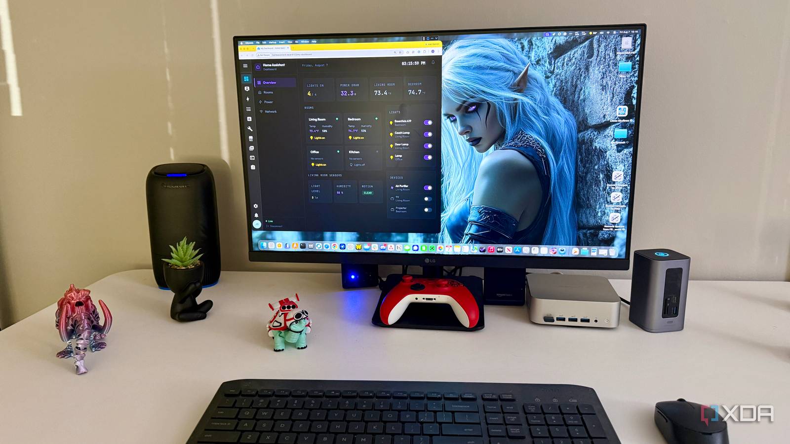
Published Aug 9, 2026, 10:00 AM EDT Jeff's been involved in the IT industry since before the Internet and spent more than 20 years working in technical support, system administration, network administration, and consulting roles. He holds an undergraduate degree in English, a Master's degree in English with a focus on professional writing and editing, and another Master's degree in Computing & Information Systems. After teaching university English and computer science for a few years, Jeff launched his writing career. He's written for Macworld, Tom's Hardware, groovyPost, The Mac Observer, and more before beginning here at XDA. Home Assistant gives me an absurd amount of control over my smart home, but that freedom has always come with a downside. It’s incredibly easy to start building a dashboard, card by card, then look up later and realize I’ve made a screen that technically works but feels all over the place. I’ve moved cards, changed layouts, stared at the result for a while, then moved the same cards again because something still felt off. Designing the dashboard in Figma first finally gave me a way to sort that out before I started poking at the live interface again, and I eventually took the idea a step further by turning that design into a working Home Assistant interface. Figma made me decide what actually belongs onscreen I stopped treating every available entity as equally important One of Home Assistant’s biggest strengths is also one of the reasons dashboards can get messy so quickly. A single device can expose several entities, and once I add servers, network gear, environmental sensors, and other integrations, the list grows fast. Home Assistant makes all that information easy to surface, which is useful right up until I start thinking every entity deserves a spot on the dashboard. Figma forced me to ask a much simpler question: Do I actually want to see this every time I open the page? That changed more than I expected. When I’m already inside Home Assistant, adding another card is easy enough that I don’t always stop to think about whether it deserves the space. In Figma, every extra block makes the page visibly busier, and there’s no live entity data distracting me from that fact. I caught myself looking at a few things and realizing I really didn’t care about them unless something went wrong. Home Assistant’s design resources helped because they present cards and interface components as having specific purposes, states, and layouts, rather than just boxes for whatever data I happen to have. That gave me a better way to think about what I was trying to build. Some information only needs a compact status indicator, while other controls deserve more room because I use them more often. Once I started thinking that way, I stopped trying to find a home for every entity Home Assistant had discovered. Building the hierarchy first made everything easier to find Important information finally had somewhere obvious to live onscreen Cutting down what I wanted to show solved only half the problem. I still had to decide what deserved the most attention once it made the cut. My dashboard includes information I glance at, controls I actually use, and details I might not care about until I’m troubleshooting. I’d given all three the same amount of space before, mostly because Home Assistant makes it easy to keep adding things without forcing me to think much about priority. Figma made those priorities harder to ignore. I could move whole groups around without worrying about breaking anything or getting pulled into configuration details halfway through. If something important felt buried, I dragged it higher and looked at the page again. If a control was taking up a ridiculous amount of room compared with how often I touched it, I could shrink it and move on. It also made me rethink how I grouped things. I’d been thinking too much in terms of devices, an easy habit to fall into when Home Assistant itself is full of device names, entities, and integrations. In practice, I care more about what I’m trying to do than which piece of hardware happens to supply the information. Grouping by use made the page easier to scan and a lot less like an inventory of everything connected to my smart home. Designing complete screens exposed problems individual cards could hide Seeing the whole dashboard changed how I judged components The Home Assistant editor naturally keeps my attention on whatever card I’m working on. I can spend a few minutes getting one card exactly how I want it, then step back and realize it doesn’t fit with anything around it. I’ve done that often enough to know better by now, but it’s still easy to get fixated on the thing directly in front of me. Figma made the whole screen the thing I was judging, not whichever card happened to be open. Figma helped me get rid of some of that ‘this entity exists, so maybe I should show it’ thinking that kept making my dashboards busier than they needed to be. That exposed inconsistencies I probably would have ignored otherwise. Spacing that looked fine on one card looked strange once three similar cards were together. Repeated information became more obvious, too, especially when two sections were essentially telling me the same thing in slightly different ways. Those problems are much easier to fix before I’ve spent time building them for real. The part I didn’t expect was that the design didn’t have to remain a static reference. I eventually built the Figma-generated interface as a web app, copied the production files into Home Assistant, and wired its controls to actual entities. The first moment that really sold me was wonderfully mundane: I tapped the office light control in the new interface, and the light responded. Once the rest of the controls appeared to be wired correctly, it stopped feeling like a mockup exercise and started feeling like an alternative frontend I could actually use. Home Assistant already gives you plenty of layout controls There’s a fair objection to this workflow: Home Assistant already has a dashboard editor. I can add cards, move them around, create sections, and see real entity states immediately instead of working with placeholders. If I were building a small dashboard with a few lights, switches, and sensors, I probably wouldn’t bother opening Figma first. That would add a step I didn’t really need. There’s also a much bigger jump between designing the interface and turning it into the interface I ended up using. I had to build the app, get the generated files into Home Assistant, and work through a rendering problem where the local version simply didn’t match the Figma design. Even after the production build produced the files I expected, the interface still wasn’t right until I changed how I exposed it in Home Assistant. None of that is especially difficult if you’re comfortable with web apps and SSH, but it’s a very different proposition from dragging a native dashboard card into place. Home Assistant threw another wrinkle at me once I tried treating the result as a normal dashboard. Pointing a dashboard at the custom URL duplicated the sidebar, while making the interface a separate landing URL defeated part of the reason I wanted it integrated in the first place. I eventually got the presentation I wanted, but it took some trial and error rather than a clean checkbox buried somewhere in Settings. If you want Figma purely as a planning tool, you can avoid all of that, and for plenty of people I think that’s the smarter stopping point. Figma keeps experimentation away from the dashboard I use I still think the extra step is worth it because I was already spending this time anyway. I just wasn’t calling it design work. Every time I moved a card, changed my mind, deleted something, added it back, or rebuilt a section because I didn’t like the first version, I was doing the same kind of experimentation inside Home Assistant. Figma gives me a place to make those mistakes, where undoing them takes almost no effort. Before you start rebuilding your dashboard, duplicate the existing view or create a separate test dashboard. That gives you somewhere to experiment with the Figma-inspired layout without disrupting the version you already use every day. It also means I go into implementation with a much clearer idea of what I’m trying to build. In my case, that meant more than recreating the layout with native Home Assistant cards, because I brought the web interface itself into Home Assistant and connected its controls. The extra work was real, and I spent more time troubleshooting the presentation than I would have liked. But once that office light switched on from the interface I’d designed, the payoff became much easier to justify. The biggest change is what I expect the dashboard to do for me. I’m less interested in showing how much information Home Assistant can collect because, frankly, I already know it can collect a lot. I want the dashboard to answer the questions I actually have and put useful controls where I can reach them without hunting. Figma helped me get rid of some of that “this entity exists, so maybe I should show it” thinking that kept making my dashboards busier than they needed to be. Designing first made Home Assistant feel considerably more intentional My Home Assistant setup didn’t gain any new devices, sensors, or automations because I opened Figma. What changed was how I chose to present what was already there, and eventually, how I interacted with them. Being able to turn that design into a functional interface made the experiment more interesting than I expected when I started. It also made me much more aware of how much of my old dashboard had existed simply because Home Assistant made it easy to put things there. That’s why Figma has earned a place in how I approach Home Assistant dashboards now, even though the implementation can get messy if I take it beyond the mock-up stage. Home Assistant gives me the building blocks, its design resources give me a useful reference, and Figma gives me room to decide what I actually want before I start configuring anything. I can stop at the design and rebuild it with native cards, or go farther and turn that interface into something Home Assistant can actually control. Either way, the important part happened before I touched the dashboard: I finally stopped asking what Home Assistant could show me and started deciding what I actually needed it to show. Figma Figma is an excellent design and web app tool, and helped streamline my Home Assistant dashboard to be more efficient and effective.
Your Home Assistant dashboard is probably showing you too much — here's how Figma helped me fix mine
Full Article
Original Source
Read the full article at Xda-developers →KhanList aggregates and links to publicly available news content. We do not host full articles from third-party sources. Always verify important information with original sources.