
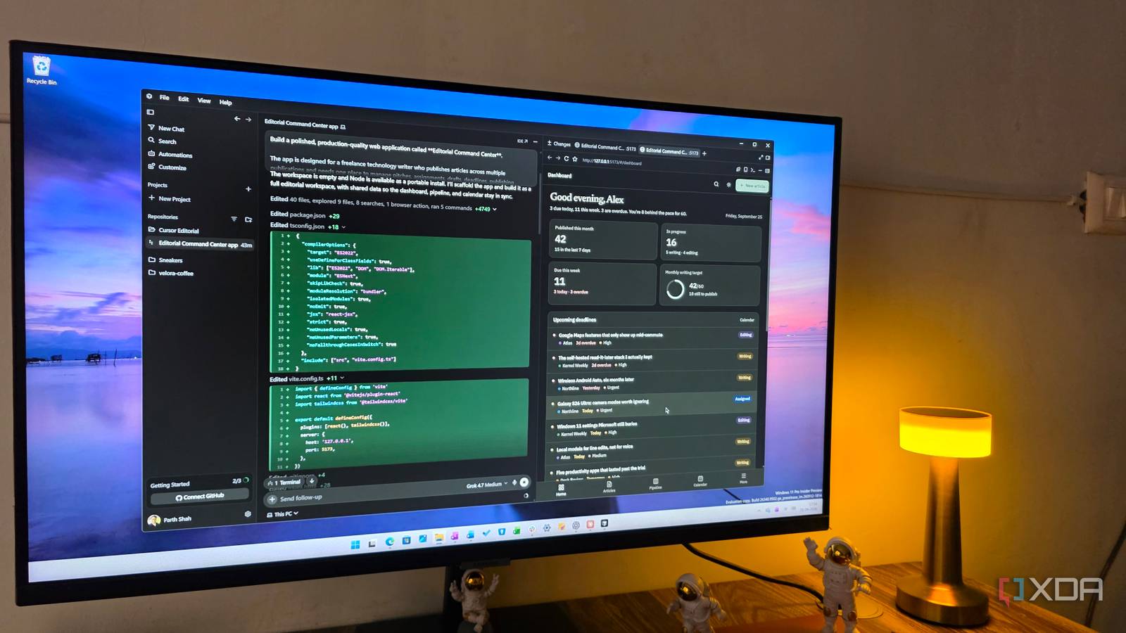
Published Sep 27, 2026, 7:30 AM EDT Parth, a seasoned tech writer, wields the keyboard (or pen) with finesse to unravel the intricacies of both Windows and Mac operating systems. He has covered evergreen content on mobile devices and computers for multiple publications over the last six years. You can find his work on AndroidPolice, GuidingTech and TechWiser. Whether it’s demystifying system updates, deciphering error codes, or exploring hidden features, Parth’s prose guides readers through the binary maze. When not immersed in tech jargon, you’ll find him sipping chai, pondering the next software review, and occasionally indulging in a friendly debate about mechanical keyboards. AI coding tools have reached a point where they can all build something that looks impressive at first glance. The real difference shows up when I start paying attention to the smaller things like spacing, component behavior, consistency, and whether the final app actually feels thoughtfully put together. To see how much that gap matters, I gave Claude Code, Codex, and Cursor a web app to build with the same overall requirements. All three did the basic job, but one showed the kind of attention to detail I would normally expect from a much more experienced developer. A word about the prompt It was designed to expose judgment I am using the exact same prompt across Opus 5.5, GPT 6 Astra, and Grok 4.7, so the comparison stays as fair as possible. These are the default, high-end, efficient models for regular coding work. The project itself is complex: I am asking each model to create a full Editorial Command Center for a freelance writer, complete with article management, deadlines, Kanban workflow, calendar, analytics, search, responsive design, dark mode, and a range of smaller UX details. I am also avoiding extra hints and follow-up corrections. Codex won the speed race Fast, polished, but slightly undercooked Codex made a strong first impression. It went with a subtle green visual theme that looked especially good in dark mode, and the overall interface felt clean and cohesive. Besides, it was easily the fastest of the three tools in my test. It finished the app almost three times faster than Claude Code and roughly twice as fast as Cursor, which is impressive considering how much I asked it to build. That speed, however, also seemed to come with a few compromises. Some of the smaller details didn’t feel quite as polished as I wanted. The typography was too small in several places, something I have repeatedly noticed with GPT-based coding models. The Kanban board also felt a little unusual because the task cards were unnecessarily tall. It made the layout less compact than I would expect from a productivity app. I also thought areas such as the Articles tab could have used another round of UI refinement. Still, none of these were major problems. The app worked well, looked good overall, and Codex got very close considering how quickly it produced everything. For this test, I would give its output a solid 8/10. Cursor nailed the aesthetics Beautiful design with a few misses Cursor won me over almost immediately with its visual direction. It used a subtle beige color palette that reminded me of a physical newspaper, which felt appropriate for an editorial dashboard. I loved the overall look. Everything felt neatly designed, spacing was consistent, and the typography was much better judged than what I saw with Codex. The whole app felt more polished at first glance. There were still a few areas where I thought Cursor could have done better. The Recent Activity section on the Dashboard felt a little plain. Both Codex and Claude Code used a timeline-style layout there, which made recent changes much easier to scan and gave the section more structure. Cursor’s implementation worked, but it didn’t feel quite as thoughtful. On the other hand, I liked what it did with the Publications page. That section felt well thought out, and it was one of the areas where Cursor showed a strong understanding of the kind of app I was trying to build. My biggest complaint was the Analytics section. Compared to the rest of the app, it felt slightly rushed and lacked the same level of polish. Claude Code handled that part much better visually. Overall, though, Cursor delivered an excellent result. I would give it a strong 8.5/10. Claude Code sweated the small stuff Slower execution, much better product judgment Claude Code was easily the slowest of the three. At one point, I was wondering whether the extra processing time would actually translate into a better result. Once I started exploring the finished app, the reason for that wait became much clearer. The Dashboard was the first place where Claude Code stood out. It wasn’t just visually pleasing; it was packed with small touches that made the interface feel alive. For example, the Recent activity panel used meaningful icons instead of treating every event the same. An accepted pitch could show a handshake icon, while a moved deadline used a calendar icon. These are tiny details, but together they made the dashboard feel like a finished product. I noticed the same attention to detail when creating a new article. Claude Code included thoughtful touches such as word-count templates. The Article section was another highlight. Rather than showing every article as one long list, Claude Code organized them into meaningful categories such as Writing, Assigned, Editing, and more. There are still a couple of things I would change. The Calendar page could have displayed today’s tasks underneath the main calendar view. I also found the standard blue theme a little boring. Cursor’s newspaper-inspired beige palette had much more personality. Those are minor complaints, though. Claude Code picked up on the finer details I hadn’t specified and made sensible UI and UX decisions on its own. I would give it 9.5/10. The real test was the developer's judgment All three tools proved that AI coding assistants are now capable of building polished apps from a single detailed prompt. Codex impressed me with raw speed, while Cursor delivered the most unique visual design. But Claude Code consistently went a step further. It noticed the smaller UX details, organized information more thoughtfully, and made decisions I hadn’t explicitly asked for. That was the difference in the end. I wasn’t looking for a tool that could complete a checklist. I wanted the one who could make sensible decisions for me and polish the rough edges. In this test, Claude Code came closest to that senior-developer experience.
I gave Claude Code, Codex, and Cursor the same complex web app to build, but only one worked like a senior developer
Full Article
Original Source
Read the full article at Xda-developers →KhanList aggregates and links to publicly available news content. We do not host full articles from third-party sources. Always verify important information with original sources.