
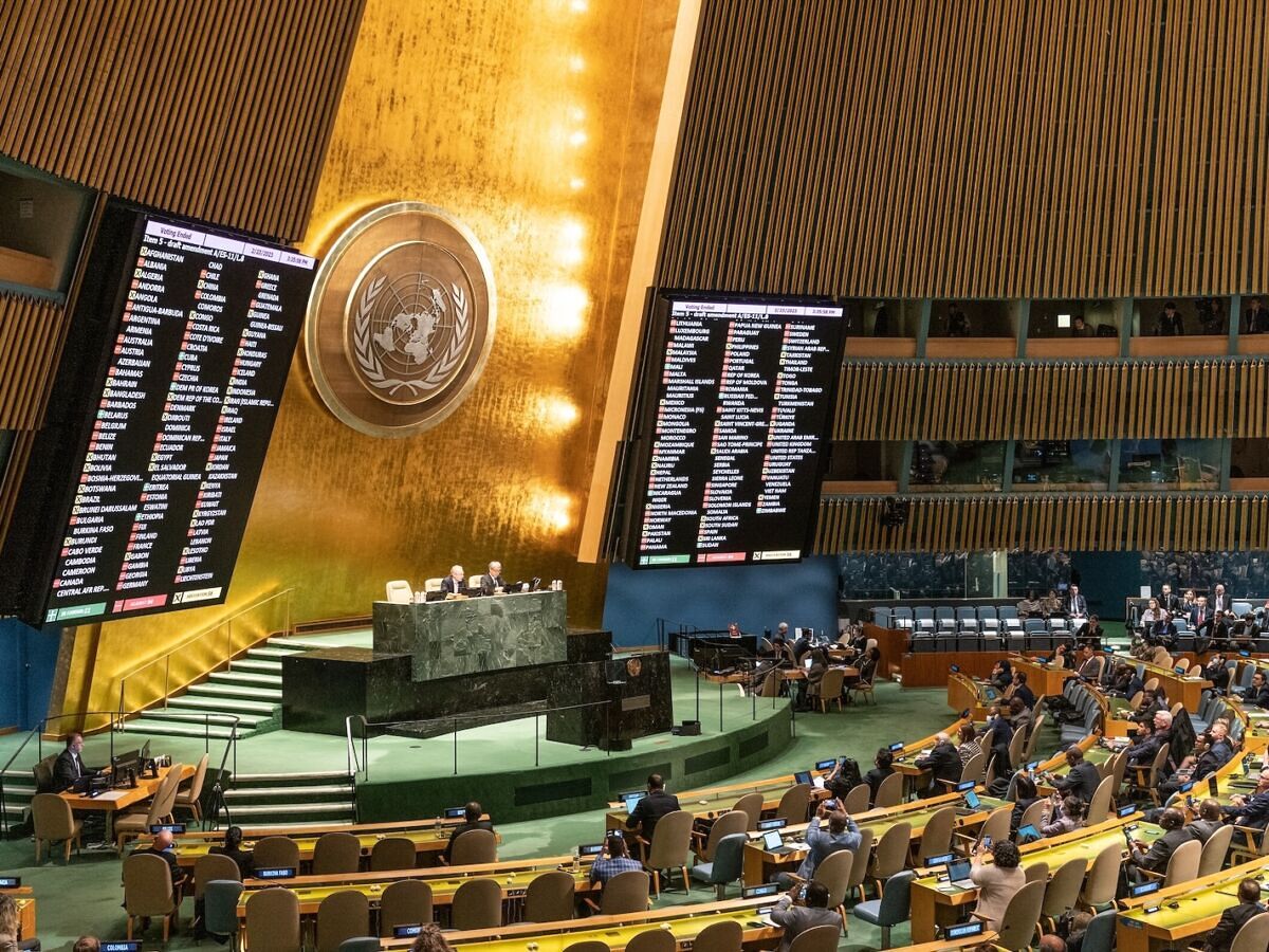
But the United Nations General Assembly — the main body of the UN in which member states vote on global issues — recently decided to do something about it. On September 4, 2026, it voted 164 to 1 to adopt a resolution to promote world maps that represent the relative size of the world’s continents more accurately — particularly Africa. The United States was the only country to vote against it. The resolution, led by Togo on behalf of the African Group (54 countries in Africa that are members of the UN) and supported by the African Union, encourages governments, educational institutions, international organizations, and other entities to “use the Equal Earth cartographic projection and equal area map projection methods, which more accurately reproduce the actual areas of the continents, where their sizes are critical.” It specifically identifies the Equal Earth projection as an appropriate option. The resolution doesn’t ban use of the Mercator projection, the current de facto world map, nor does it require every map in the world to be redrawn. It’s a nonbinding resolution (as most UN resolutions are) that encourages entities to use the Equal Earth map and think about the impacts of map distortion while acknowledging that different map projections serve different purposes. Why the Mercator map looks the way it does An early version of the Mercator Map. Photo: steve estvanik/Shutterstock The Mercator map wasn’t ever meant to be an overarching global tool, or at least not a political one. It was created for sailing. In 1569, Flemish cartographer Gerardus Mercator (hence the name) published a large world map depicting the countries a certain way. On his map, a straight line is a compass direction, so sailors could draw a course across the ocean with a ruler and just hold that direction to accurately get where they were headed. It was designed to solve a problem for sailors, not accurately represent the world. Now that ships and planes run on GPS, there’s far less need for a map in that format. On a typical Mercator world map, Greenland appears much larger than its actual area, especially relative to Africa. The distortion isn’t because the data it’s based on is wrong, but because of what happens when you transfer a curved shape onto a flat plane. That stretching increases the farther a landmass is from the equator, so places near the poles look oversized while those near the equator are more accurate. For the African Union, the issue goes beyond whether a map is visually pleasing. In a March 2026 speech, African Union Commission Commissioner Amma Twum-Amoah said the Mercator projection “shrinks Africa on the world map,” and argued that its distortion leads people to underestimate the continent’s economic, cultural and geopolitical significance. How the Equal Earth map was created The Equal Earth map also challenges the idea that certain continents are above or below others. Photo: Equal Earth The map the UN just decided to support wasn’t created at the UN. The Equal Earth map was developed in 2018 by three cartographers who wanted to create a more accurate and more equal map that wouldn’t look totally unfamiliar to those familiar with the Mercator map. The idea began in 2017 after the Boston public school district decided it would use the Gall-Peters projection in its classrooms — an equal-area map that shows countries and continents at their correct sizes, though it distorts their shapes. It started global conversations among cartographers and in the media, and the creators of the Equal Earth map said it motivated them to create an even better solution. The Equal Earth map was published online in 2018, and the authors describe it as an “equal-area pseudocylindrical projection,” meaning the size of countries and continents is accurate, but their shapes are altered by the process of flattening the globe. Those shapes are also designed to create a more recognizable look for each continent so it’s easier to understand. NASA’s Goddard Institute for Space Studies began using Equal Earth in 2018 for global temperature maps, and the National Geographic Society has been using it for years for maps and educational materials. The push to adopt it at a worldwide scale began recently. In February 2026, African Union leaders said the organization had decided to adopt the Equal Earth map. Togo subsequently brought the issue to the United Nations, where it was quickly supported by the African Group. Months later, it was agreed upon by the rest of the UN, save for the United States. More like this
Your Map Has Been Lying About Africa Your Whole Life. The UN Finally Did Something About It.
Full Article
Original Source
Read the full article at Matadornetwork →KhanList aggregates and links to publicly available news content. We do not host full articles from third-party sources. Always verify important information with original sources.