
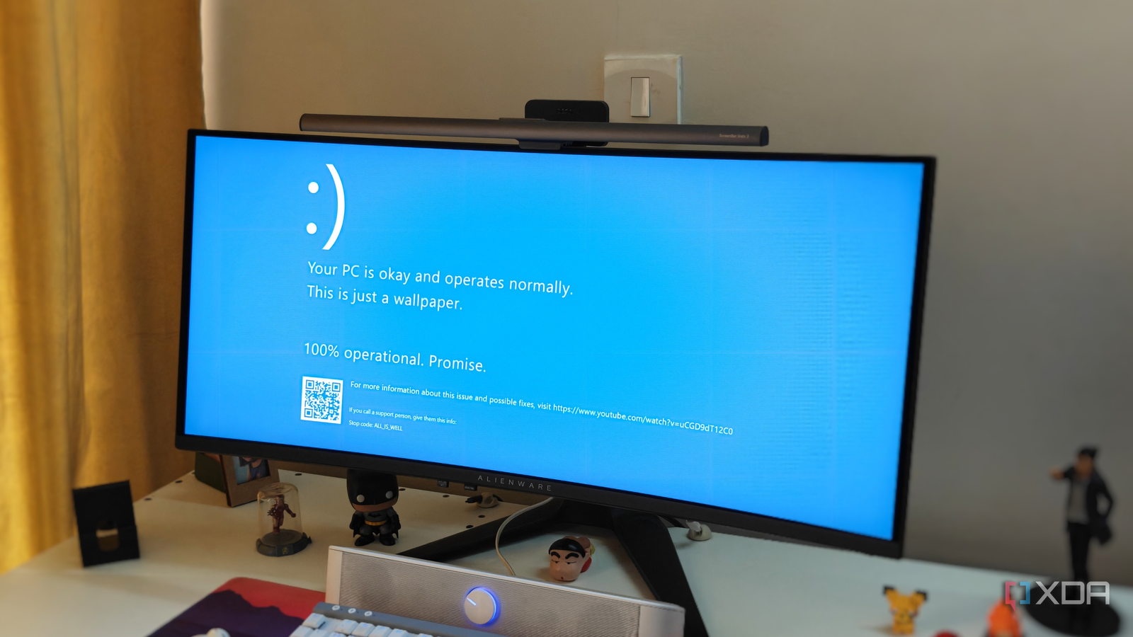
Published Oct 14, 2026, 8:00 PM EDT After a 7-year corporate stint, Tanveer found his love for writing and tech too much to resist. An MBA in Marketing and the owner of a PC building business, he writes on PC hardware, technology, and Windows. When not scouring the web for ideas, he can be found building PCs, watching anime, or playing Smash Karts on his RTX 3080 (sigh). The iconic blue screen of death (BSOD) has graced some of our worst Windows moments over the years —moments when your PC completely gave up. This error screen is reserved for catastrophic errors that prevent Windows from functioning normally. The OS displays the details of whichever process caused the fatal crash, and restarts itself to avoid damage to your data and hardware. Interestingly, the Windows BSOD didn't have to be blue. The choice goes back to Microsoft engineers working on Windows NT who picked the color because it was familiar, not because it signified something important. The choice stuck for decades before Microsoft finally swapped blue for black in 2024, ending the three-decade legacy of the blue screen of death. The blue color was born out of convenience Microsoft just winged it The blue screen of death, as we know it, can be traced back to the development of Windows NT 3.1 in the early 90s. Microsoft developer John Vert was working on the NT kernel code that displayed the stop screen by switching the display into text mode and adding the error message on it. He picked the white-on-blue design of the BSOD that shipped with Windows NT 3.1 in 1993. The reason behind the choice was practical more than anything else. The MIPS workstation he worked on used a white-on-blue color scheme for its firmware boot screen. Plus, the SlickEdit text editor used by many Windows NT developers at the time had the same default color scheme. He simply used the same design for the new Windows stop screen, so that it felt consistent and also easier to read. If Vert's workstation had used a different default color scheme, the BSOD that we know would never have been blue. There were no brand guidelines or technical limitations behind the blue screen. It could have been black, like Windows 3.1's crash screen, or even green, as seen today on Windows Insider Preview builds. Windows NT wasn't the first version to have a blue screen But it was the first one to have a true BSOD Credit: Wikimedia Commons Curiously, even Windows versions before NT had featured blue screens, although they weren't technically stop screens or "screens of death." On Windows 3.1, pressing Ctrl + Alt + Del on the keyboard brought up a screen that allowed you to close a stuck program. It was written by Steve Ballmer, and Microsoft engineer Raymond Chen referred to it as the "blue screen of unhappiness." A few years later, Windows 95's error screen, which Chen himself worked on, also displayed white text on a blue background. It allowed the user to either ignore the error and continue using the PC or restart the system. Later versions, like Windows 2000, XP, Vista, and 7, started giving more information on the BSOD to give users a clue about what had crashed the system. Then, Windows 8 revamped the terminal-style, text-only look of the BSOD, giving users a different shade of blue, modern font, and a huge sad smiley. It also removed any additional information about the error, leaving people guessing. BSODs weren't as common by then, and Windows 10 continued the same look, but it added a QR code that users could scan for additional information. The BSOD hasn't been "blue" for a while Black is the new blue Credit: Wikimedia Commons Sadly, the "B" in BSOD no longer stands for "blue" anymore, thanks to Microsoft making the change in Windows 11 24H2 back in 2024. It's now the black screen of death, if you want to be accurate. Although Microsoft had attempted the same transition in 2021, complete with the sad face and QR code, it rolled back to the familiar blue screen pretty quickly. With the 24H2 update, however, the company committed to adopting the new BSOD to bring it in line with other modern Windows design choices. It cited a more streamlined UI as the motivation for the switch. The QR code and sad face were removed, and the text was simplified to "Your device ran into a problem and needs to restart." An error code remains at the bottom, accompanied by a progress counter above it. Most users didn't seem to be fans of the "switch to black." It looks more like a Windows update screen rather than a fatal error screen. Talking about it is moot since it's been two years already, but it's worth pointing out that the blue screen of death wasn't just a visual choice. It had become synonymous with the times your PC ran into an unsolvable error, and the black screen just doesn't feel the same. No one wants to see a BSOD, but blue is still better than black Microsoft wanted to simplify the stop screen and changed it from blue to black. However, I believe the black screen of death is way more intimidating than what we had before. The blue theme was relatively calmer and didn't instill a sense of dread as the black screen does now. The old BSOD also didn't look like a Windows update screen, so there's that. Windows 11 Home A USB installation drive and license key for Windows 11 Home.
The Windows blue screen of death could have looked completely different if a 33-year-old decision had gone another way
Full Article
Original Source
Read the full article at Xda-developers →KhanList aggregates and links to publicly available news content. We do not host full articles from third-party sources. Always verify important information with original sources.