
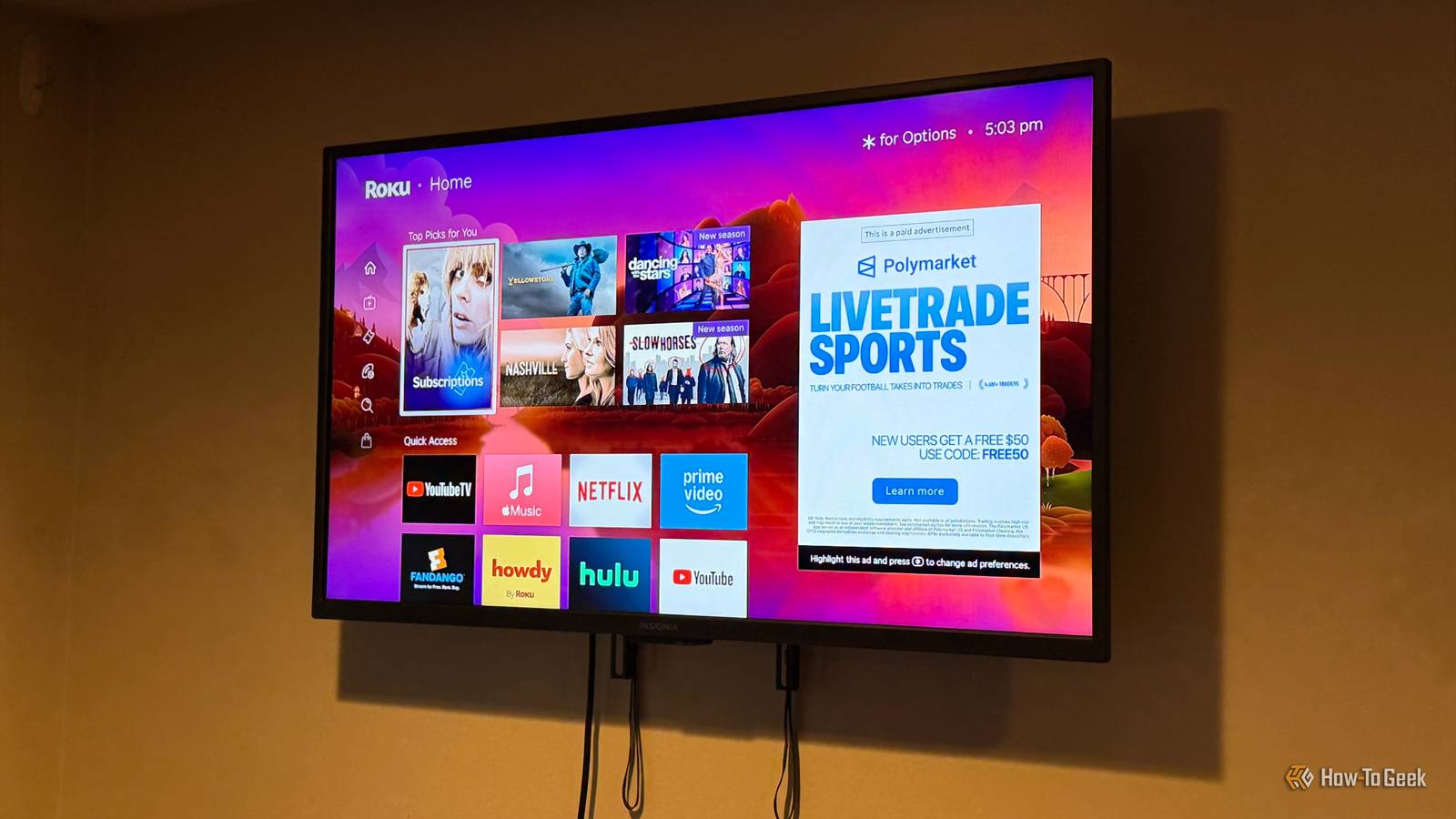
Published Sep 22, 2026, 8:15 AM EDT Nathaniel Pangaro is a tech enthusiast who dives deep into Apple’s world, from Macs and iPads to iPhones, Apple Watches, and every gadget in between. He loves turning tricky tech features into guides and reviews that are actually fun to read—and easy to use. At AppleInsider, he broke down the latest Apple releases with hands-on testing, clear explanations, and visuals that make readers feel like they’re right there with him. He also keeps SEO in mind so people can actually find his work online. He’s also written for The Student Loan Help Group, turning tech and finance topics into simple, helpful, and engaging content. Nathaniel also takes photos and creates rendered visuals to showcase devices and highlight features. When he’s not writing, Pangaro enjoys listening to music, working out, baking, and spending time with his pets. These hobbies help him recharge and bring a fresh, creative perspective to his work, keeping his writing energetic and relatable. Pangaro's goal is simple: help readers get the most from their Apple devices and actually enjoy doing it. If you have a Roku, then you know the home screen is no stranger to advertisements. Whether you're scrolling through your apps or just taking in the pretty landscape of Roku City, ads are everywhere. Now, you can’t turn off ads altogether on Roku, but there are ways to limit them. However, Roku recently released a new home screen update, but it seems more about ad space than usability, which feels at odds with what so many users, like me, want. Roku greatly changed the home screen The upgrade has some downgrades In late May, Roku released a major software update that drastically changed how users navigate the home screen. As Roku put it, “Today we’re rolling out our biggest update in more than a decade, shaped by deep behavioral insights and what we’ve heard directly from customers.” While this update brings a bunch of positive changes, like faster content discovery from the apps you have installed, it gets pushed down by the update's heavy lean on ads and clutter. Credit: Nathaniel Pangaro / How-To Geek For instance, when you launch the new home screen, you’ll see a huge ad on the right side of the screen that is nearly the height of four app rows. Previously, an ad this size didn't exist on the home screen, but that changed with this update. It would be one thing if the ad were based on content the viewer — like me — watches, but it's clear the ad space isn’t only for shows and movies; it's for products and various companies too. This makes it feel more like a billboard for anything and everything than a way to discover new content you would like. Credit: Nathaniel Pangaro / How-To Geek Furthermore, ads seem to be everywhere you turn, even when one moves out of frame. This is clear when you open the side menu: it pushes the huge ad on the right of the screen aside, then introduces a smaller rectangular one at the bottom of the side menu list. This ad placement takes up space that could be used for other material, like apps or different content. But additional ads aren’t the only way Roku has violated your home screen; they also make your apps harder to access. Credit: Nathaniel Pangaro / How-To Geek Before, your installed apps were right under the recommended row for easy access, but now they’re buried. You have to scroll past multiple sections to get to your apps, such as Next Watch, What Are You in the Mood For?, and The Best Across Your Streaming Services. While the Quick Access section could show the app you are looking for, it's based on an algorithm that constantly changes. However, there is a quick way to get to them: scroll up and start at the bottom of your installed apps, but personally, that doesn’t feel natural. Even though I know that is an option, I still find myself scrolling past all the sections to get to the specific app I am looking for that isn’t in the Quick Access section. Credit: Nathaniel Pangaro / How-To Geek While the new design was supposed to modernize and declutter the home screen — like how the side menu now collapses and isn’t always exposed — it seems to have cluttered it more, especially with ads and unnecessary sections. Luckily, you can tweak this issue. Fixing up your home screen Configuring your settings for a better layout As mentioned earlier, you can't disable all ads, but you can minimize how often Roku switches to sponsored content and reduce clutter on the home screen. Credit: Nathaniel Pangaro / How-To Geek Personally, some areas were becoming overbearing. For example, my wallpaper changed periodically to show promotions, events, TV shows, or movies, which I didn’t want. My wallpaper is intentional because I chose it based on the upcoming season, so it is now set to a fall theme. I don’t need to see advertisements for content I don’t care about. Roku Ultra $91 $99 Save $8 Operating System RkuOS Connectivity luetooth, Ethernet, HDMI, USB, Wi-Fi The impressive Roku Ultra has everything you'd want from a streaming device, with Dolby Vision and Atmos providing quality 4K picture and sound. Roku Smart TV (2026) Roku's latest smart TV is a great budget option, offering 4K visuals on a QLED screen with HDR10. Additionally, even though Roku claims it is to “celebrate” what is being shown, it is just another way to advertise. This is why I turned this feature off quickly. To do this, go to Settings, then scroll down to the Theme section. From there, go down to the Additional Settings section, find Sponsored Wallpapers, and turn it off. Credit: Nathaniel Pangaro / How-To Geek This is on by default, and while it says it's recommended, I still turned it off so my choice wasn’t interrupted. Recommended rows Credit: Nathaniel Pangaro / How-To Geek Recommendations are helpful, but they don’t always have to be displayed. This is true of the Top Picks For You section at the top of the Roku home screen. Even though these are not technically ads, they can be viewed as such because streaming services often pay for these placements to highlight specific shows or movies. Credit: Nathaniel Pangaro / How-To Geek While it’s a nice idea, I don’t want it all the time. However, you can't completely remove the Top Picks For You section, but you can hide it. Go into Settings and find the Home Screen section. Look for the option that says “Recommendations row” and change it from Show to Hide. Credit: Nathaniel Pangaro / How-To Geek Now, when you return to your home screen, those rows will be gone and replaced with the Quick Access section. Unfortunately, you cannot remove the Quick Access section altogether, but you can remove individual apps by holding the star button on your Roku remote. However, you must have at least one app in the Quick Access section. If you try to delete the last one, a new batch of apps will appear. Living with the new home screen With the new Roku home screen, it’s fair to say that it’s not perfect. It adds clutter with curated sections and ads while burying your installed apps underneath everything. While you cannot revert to the old home screen style, there are ways to lessen the changes. Maybe with enough user feedback, ads and clutter will lessen — or be more customizable — in future updates.
Stop letting Roku bury your apps under ads and recommendations
Full Article
Original Source
Read the full article at Howtogeek →KhanList aggregates and links to publicly available news content. We do not host full articles from third-party sources. Always verify important information with original sources.