
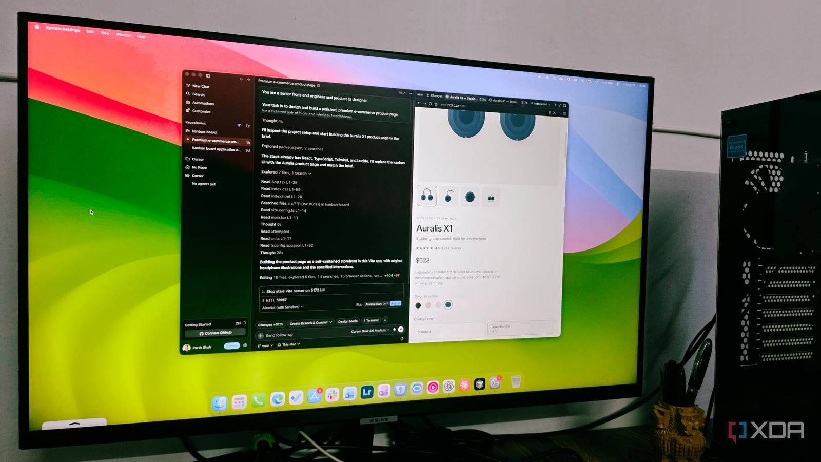
Published Sep 3, 2026, 7:00 PM EDT Parth, a seasoned tech writer, wields the keyboard (or pen) with finesse to unravel the intricacies of both Windows and Mac operating systems. He has covered evergreen content on mobile devices and computers for multiple publications over the last six years. You can find his work on AndroidPolice, GuidingTech and TechWiser. Whether it’s demystifying system updates, deciphering error codes, or exploring hidden features, Parth’s prose guides readers through the binary maze. When not immersed in tech jargon, you’ll find him sipping chai, pondering the next software review, and occasionally indulging in a friendly debate about mechanical keyboards. Building a simple webpage with AI isn’t hard anymore, but making it look polished and intentional is a different story. It’s easy for a model to generate working code; it’s much harder for it to balance margins, pick the right contrast, and keep every visual element aligned. I wanted to find out which flagship tool has the best eye for design, so I tasked Claude Opus 5, GPT-5.6, and Grok 4.6 with the exact same website interface. While all three produced something functional, the tiny details immediately separated the average results from the truly impressive ones. A word on the prompt And my preferred IDEs To put each model to its limits, I skipped vague prompts and put together an end-to-end design brief: building a full-stack, production-ready e-commerce product page for a fictional high-end audio brand called Auralis. The prompt left zero room for shortcuts. It demanded strict brand guidelines, custom color palettes, exact layout ratios, interactive elements, and full mobile responsiveness using React, TypeScript, and Tailwind CSS. To keep the playing field realistic, I ran this prompt directly inside each model’s native environment: Claude Opus 5 in Claude, GPT-5.6 in ChatGPT, and Grok 4.6 in Cursor. GPT-5.6 Functional at first glance, but flawed in the fine details At first glance, GPT-5.6 seemed to hit a home run. It generated a complete, working React component on the very first try without throwing syntax errors or choking on the brief. The layout structure matched the requirement, the color palette felt polished, and the main hero section looked reasonably well put together. But the moment I loaded the preview and started actually using the page, the issues in its design choices began to show. The most obvious problem was the typography scaling. For some reason, GPT-5.6 has a recurring habit across all my testing of making body text and secondary labels way too small. Things got worse once I started interacting with the components. The technical specification menu was poorly designed. Instead of giving each spec item its own distinct detail, it recycled the same generic copy across multiple sections. The ‘You may also like’ section also felt like an afterthought. The proportions were awkward, image placeholders lacked visual balance, and the cards lacked refined spacing. The footer was needlessly massive. GPT-5.6 proved it can follow instructions and spit out functional code fast, but its default eye aesthetic balance left a lot to be desired. Grok 4.6 Blazing speed and sharp typography with minor UX stumbles Running Grok 4.6 inside Cursor was an impressive experience right out of the gate. The speed is excellent, and it nailed the typography from the jump. Font sizing, line heights, and letter-spacing across the hero and feature sections felt deliberate, readable, and scaled for a luxury audio brand. That said, it wasn’t a home run once I dug into the details. The visual execution of the main headphone mockup fell a bit flat. The Technical Specifications menu fell into the same UX trap. It broke down every single minor specification into its own individual row. Having to manually click and expand a drawer just to read a single one-line spec felt frustrating. Much like GPT-5.6, Grok struggled to give the ‘You may also like’ accessories grid the polish it deserved. On the flip side, Grok nailed the footer design. The dark background, compact padding, sharp columns, and clean newsletter form looked like they were straight from an Apple or Nothing storefront. Despite some minor struggles, Grok 4.6 delivered a cleaner visual hierarchy and much better text proportions than GPT-5.6. Claude Opus 5 Thoughtful UX and the clear winner of micro-polish Right off the bat, Claude implemented a sticky, translucent header that stayed neatly anchored as I scrolled down the page. Being able to jump between sections effortlessly without manually scrolling all the way back to the top gave it the polish of a commercial production site. Unlike Grok’s endless clicking chores or GPT’s repetitive text, Claude found the sweet spot in the Technical Specifications menu. It presented key spec highlights upfront in a clean overview and used accordions to expand into crisp, one-sentence explanations that added value. In the reviews section, Claude was the only model smart enough to include a clean ‘Read All Reviews’ action button alongside the rating distribution breakdown. The ‘You may also like’ section looked fantastic. The products are neatly designed compared to GPT and Grok. It wasn’t entirely flawless, though. Much like Grok, Claude’s generated placeholder art for the main headphones felt a bit off. Also, when I toggled over to the ‘Travel Bundle’ configuration, the dynamic total price failed to recalculate and stayed at $449. Despite that minor pricing glitch, Claude Opus 5 came away as the clear winner. One got the design right Any flagship AI can generate a working web page, but the real differences show up when it turns a strict design brief into a refined user experience. GPT-5.6 got the code working fast, but failed on basic typography. Grok 4.6 brought great speed and sharp visuals, yet tripped over small details. Ultimately, Opus 5 won by focusing on what matters most in a real website: sticky navigation, thoughtful layout choices, and micro-details.
I asked Claude Opus 5, GPT-5.6, and Grok 4.6 to copy the same polished UI — tiny details exposed the winner
Full Article
Original Source
Read the full article at Xda-developers →KhanList aggregates and links to publicly available news content. We do not host full articles from third-party sources. Always verify important information with original sources.