
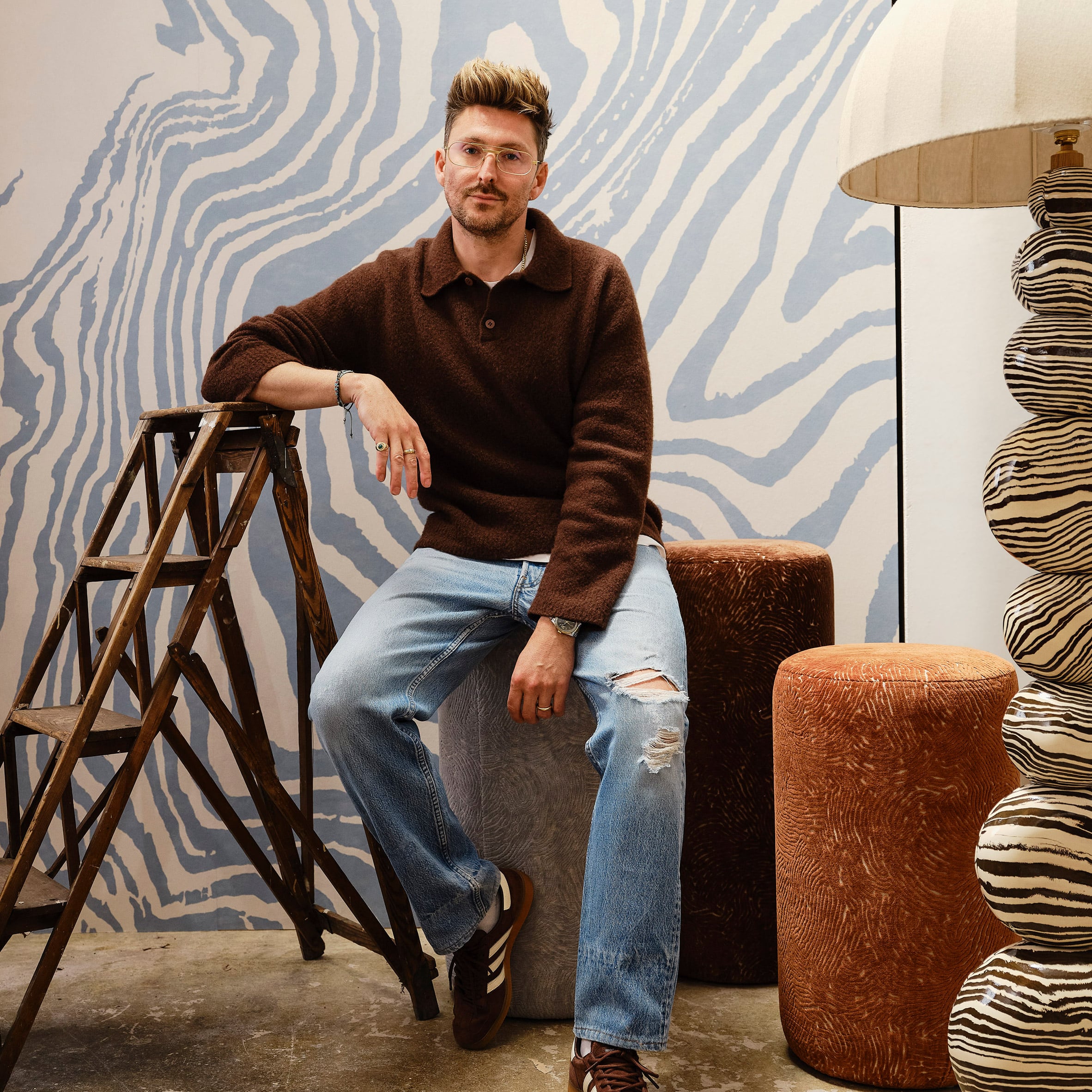
Designer Henry Holland‘s textual fabric and textile collection for luxury interior furnishings company Harlequin was informed by his work as a ceramicist, he tells Dezeen in this interview. Simply named Harlequin x Henry Holland, the collection of wallpapers and fabrics was heavily influenced by both the extensive archive of Harlequin’s parent company Sanderson and Holland’s love of the Japanese pottery technique nerikomi. “The starting point for the collection was our ceramic work,” Holland told Dezeen. “We used the organic patterns and forms created in our handbuilt work as the starting point, and then similarly we built the colour palettes around the clays that we use to create our pieces.” “To add further depth and range to the collection, we also delved into the incredibly rich archive that the Sanderson group have across all of their brands and reinterpreted some archive prints that felt like the right additions to the collection.” Henry Holland has created a collection for Harlequin The collection features four distinct fabrics that translate ceramic patterns and colours into materials that can transform interior spaces. For Holland, this transformation of scale, from a hand-held object to entire rooms and interiors, was the most exciting part of the collaboration. “For me, the collection is really about taking the language we have developed through ceramics and allowing it to live on a completely different scale,” he said. “At the studio we make objects that sit within a room, whereas with Harlequin we suddenly had the opportunity to take those patterns, colours and textures and make them become the room,” he added. “There is something really exciting about that shift in perspective. Our work has always been about balancing the graphic with the organic, and I think that really comes through in the collection. There are moments that feel bold and energetic and others that are much softer and quieter.” The collection was informed by ceramics Holland worked closely with the Harlequin team to understand which elements of the nerikomi technique could be translated and upscaled to fabric. He found clear similarities in methodology between the technique and the process of making textile fabrics. “With nerikomi, the pattern isn’t something that is applied to the surface afterwards – it is created through the material itself by layering, compressing, slicing and rebuilding different coloured clays,” he said. “There is always this balance between control and chance, which is something I love about the process.” “Working with the Harlequin team and looking at those surfaces and identifying elements within them that could become a wallpaper or a fabric was fascinating,” he continued. “We were able to isolate gestures, enlarge details and play with scale in ways I wouldn’t necessarily have considered. Some tiny detail from a ceramic piece can suddenly become this huge, immersive pattern across a wall.” The patterning evokes the Japanese pottery technique nerikomi Holland has a personal connection to each of the four fabrics developed for the collection – Southborough, Elsworthy, Great Hey and Blenets Check Mini – and each was named after one of his and his partner’s former homes. “We created a really autobiographical narrative by naming the patterns and pieces in the collection after homes that my husband and I have lived in through our lives,” he said. While the patterning on the fabrics, which ranges from checkerboard in Blenets Check Mini to moiré-style in Elsworthy and chevrons in Southborough, was informed by ceramics, so too were the colours selected. Pastel tones of chocolate and moss were informed by unglazed pottery, while Holland looked to glazed earthenware for the collection’s bolder colours. “We were able to split the palette into more subdued, almost pastel tones, taking our lead from our unglazed ceramics, and then a bolder level of colour where we used our glazed pieces as the reference,” explained Holland. “It was really important to me that, even though we were translating the work into completely different materials and applications, everything still felt very rooted in the studio and recognisably ours.” Each of the pieces in the collection has a distinct feel Although the fabrics and wallpapers in the collection each have a distinct aesthetic and feel, Holland believes the pieces form a coherent collection because they come from a shared creative thought process. “They share a common DNA because ultimately they all come back to the same source material, which is the ceramics,” he said. “Within my ceramic work there has always been a contrast between very precise pattern and much looser, more organic pattern. Some pieces can be incredibly controlled and almost mathematical, while others are much more fluid. I didn’t want to lose that contrast when translating the work into print,” he continued. “What brings everything together is colour, movement and the sense that everything has been touched by hand. Even when the patterns are quite different, there is a shared irregularity and energy to them. Nothing feels too perfect or overly digital, and that was really important to me.” The Southborough pieces include chevrons Holland hopes designers will use the collection’s fabrics in a wide variety of interiors, working out how to combine and layer pieces to create unique and interesting spaces. “I don’t think there should be too many rules around how it is used,” he said. “One of the things we really wanted was for the collection to have enough cohesion that you could layer different elements together without everything having to match perfectly.” “The colour stories run throughout the collection, so you can pick up a tone from one of the more expressive wallpapers and echo it through a fabric or a quieter pattern elsewhere in the room,” continued Holland. “I think interiors are much more interesting when there is that kind of tension.” Great Hey has a ladder design Overall, Holland hopes people will enjoy using the fabrics and wallpapers and enjoy the spaces that are created. “Ultimately, I want people to have fun with it,” he said. “I like interiors that feel collected and personal rather than overly prescribed.” “Hopefully the collection gives designers and customers the tools to create spaces that have personality, warmth and a real sense of individuality,” he continued. The collection is the result of a deep collaboration between Holland and Harlequin, which has resulted in its success. “It was a very genuine back-and-forth process,” said Holland. “I didn’t want to simply hand over some ceramic patterns and say, ‘turn these into wallpaper’.” “The interesting part was bringing together what we know about ceramics and pattern at Henry Holland Studio with Harlequin’s incredible knowledge of textiles, wallpaper, colour and interiors,” he continued. “We started with the ceramics and the archive of patterns and colour combinations we have developed at the studio, and from there the Harlequin team began exploring scale, repeats, textures and different interpretations. We would respond to those, push certain things further, pull other things back and keep refining the palette.” Holland believes this close collaboration is key to the collection’s success. “I think the best collaborations happen when both sides bring something to the project that the other couldn’t necessarily achieve alone,” he said. “There are things in this collection that feel Henry Holland Studio completely, but they have been transformed through Harlequin’s expertise into something entirely new. That’s what made the whole process so rewarding.” Read more
Henry Holland creates wallpaper and fabric collection with a "language developed through ceramics"
Full Article
Original Source
Read the full article at Dezeen →KhanList aggregates and links to publicly available news content. We do not host full articles from third-party sources. Always verify important information with original sources.