
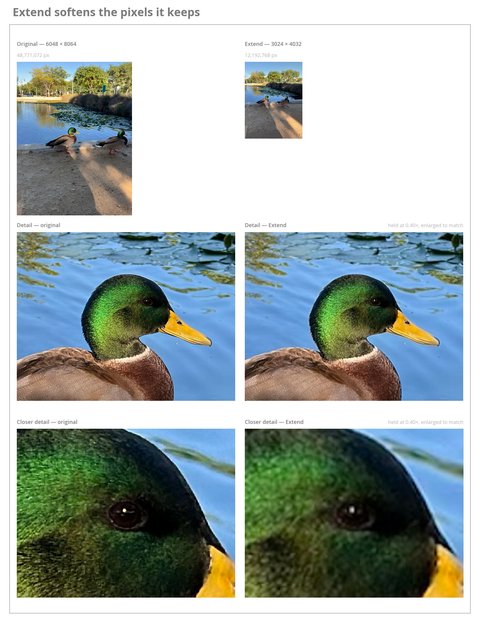
In its 27 operating system releases, Apple added loads of generative image editing tools, and the tools have incrementally changed since they were introduced over the summer. I’m going to take my 20-plus years of experience in visual effects and talk about how well those tools work in practice. I’m not going to get into a whole preamble about how I really do think it’s OK for you to edit a photo, or the video comparing the initial release of Clean Up with comparable retouching tools. People can do bad things with image editing tools, but I don’t believe that photos people take of their lives should be treated like courtroom evidence. Having said that, it’s important that tools set users up for success by guiding them toward making good choices that preserve as much of their original images, and their original intent, as possible. Data loss of original pixels can be a trade-off to get an adjustment that people want, but tools shouldn’t hide the data loss from users. Lesson number one in VFX is that you’re only changing the pixels you have to change for the effect the client wants. You do not de-noise (or de-grain) your entire image (or image sequence) to do your work and then send that back to the client. You do not re-noise the entire de-noised image either; if it can be helped, you control the region you are editing in your image to confine your work. As much of the original image as possible should pass through. Click the button on the left to toggle back and forth between the edited and unedited view. Apple doesn’t always disclose to the user how its generative tools are impacting the images. That includes things like maximum resolution caps, filtering the pixels that are being kept, blurry boundaries, and potential color and value shifts. There is the Show Photo Without Edits button, which Apple provides to let people see before and after a generative edit has been made. I strongly encourage everyone to use that button. But it won’t tell you about lost resolution, and when the image is scaled to fit to the window, you may not be able to see the damage. It’s totally fine if you’re happy with the zoomed-out version, and it suits the purpose (a lock screen image, a desktop, whatever). For a lot of people, they’re the same picture. Just know that these tools don’t really match your original sensor noise, and as of the 27.2 release the images are now watermarked with SynthID, even though Apple does not disclose that to users in the interface, so they can’t decide if the change they’re making is worth the image being “AI” since SynthID doesn’t disclose the editing chain.1 Pretend extend doesn’t just append Cutting off the edges of a photo, and adding on to the edges of a photo, are unsurprisingly related. So much so that Apple reused its aspect-ratio crop selection code for the interface of its Extend tool. (This should be in the Crop interface.) At the very least, Apple should change the code it’s reusing from the aspect ratio bounds resizing so that it fits to the bounds of the input as a minimum dimension when toggling between 3:4 and 9:16. Because right now, changing the aspect ratio in Extend can crop the image, which is what you want for Crop… but not for Extend. https://sixcolors.com/wp-content/uploads/2026/11/extend-aspect-bounds-272-6c.mp4Cycling the aspect ratios in Extend. The selection shrinks inside the photo rather than pushing past it. I don’t like the hazy blur effect at the edges, because users should be able to manipulate a single edge of their image without messing with pixels all the way around. There’s no useful way to snap to fit the original bounds in order to use as much original image as possible. You just have to kind of eyeball where you’re dragging the reticle. https://sixcolors.com/wp-content/uploads/2026/11/extend-48mp-softness-6c.mp4Changing the aspect ratio in Extend, and the haze landing on all four edges whether or not you are pushing them out. The border around the entire image softens to blend with the generative extend features. The core of the image softens from being scaled down. The unfortunate truth is that Extend throws away image data. It only looks like it keeps your original pixels when you’re zoomed way out. It perceptually reads like you’ve extended your image, but what’s really happened is that the original image is actually scaled down and resampled to be a smaller resolution so that your generative border, plus your original pixels, all fit in a 12.19-megapixel canvas. It appears that Apple is using a soft filter to resample the image—not even a sharpening filter, because everything is definitely softer and there are no ringing artifacts associated with sharpening. The blurry border from the crop preview is also true to what’s happening, because the entire border is blurry. There seems to be about 200-300 pixels of a feathered mask operation that takes your scaled-down photo and combines it with the generative edge. This 48 megapixel image is extra soft because it hits the resolution cap for Extend and the entire image is scaled down even further. Feathers and specular highlights all smear even though they have nothing to do with the edge of frame. Scaled to show relative alignment when extending equally to the maximum value along all borders. The final image is nearly the same resolution as the original. Some diagrams showing the bounds differences and the impact on the original resolution. Imagine that I said that I wanted to add a room to a one-story house that had no property boundary constraints, and the contractor did it by demolishing the house and building a scaled-down replica of the house, then adding the extra room on so the whole house took the same square footage. That’s some Nathan Fielder behavior. If the generative maximum is 12.19 MP, or something around that, why not take those generative pixels and scale those up to match the increased bounds so that the original core can be preserved? Don’t blend any borders that aren’t actually being extended! Forcing everything to fit some technical constraint rather than making preservation of data the constraint is backwards. Another place where data could be pulled from to improve quality is other neighboring photos you’ve taken. Extend doesn’t use other photos in your camera roll from the same time frame, or location, as context. You can easily see this for yourself if you duplicate a photo, crop the photo, and then use Extend on the crop, you won’t get buildings sourced from the neighboring image. It’s a silly test, but it just confirms it’s not happening. Context is very important to getting good results, because it’s what a real photo retoucher would do, or a VFX artist. It’s one thing if you don’t have the data, in which case filling in what was probably there is much more impressive, but if you could have filled in what you have photos of, then you should do that. Which brings us to… Reframe to blame for eye strain The Reframe feature is the most “we repurposed something” of the models. I would argue that it is not a creative image editing tool at all, but it is very clever. If you look at Apple’s ML Sharp, or any of its other myriad projects around 3D computer vision, you can see a lineage of sorts. (This means that things like reflections and refractions do weird stuff. Pond surfaces, shop windows, wine glasses, and the like.) Reframe lets you move around quite a bit, and you’ll see all the stretchy weird stuff, and holes, from areas where the camera did not have line of sight. Reframe does not use context from surrounding photos, or video, to fill in those missing pieces, unfortunately. Instead those holes are filled in with speculation from some kind of model. Reframe doesn’t retain any of your original images, even scaled down, like Extend does. It’s filling in everything seemingly guided by its extrapolated 3D view that’s full of holes. It doesn’t have access to the original imagery to paste back in. However, where Extend mostly softens and mushes original pixels, Reframe also has tone and color shifts that are not anchored to your original image. The virtual camera barely moves, and all hues and tones shift. The egret frame, for comparison, original to Reframe. https://sixcolors.com/wp-content/uploads/2026/11/reframe-egret-reflection-6c.mp4Dragging the Reframe controls. Watch the reflection rather than the bird to see a dent in the water. These color and value shifts are not uniform, and aren’t restricted to certain file types. The SDR image from my Sony a6400 has shifts, and the egret photo was taken with Project Indigo, not the Camera app. There isn’t an entirely consistent and predictable direction of color and tone shifts. Sometimes it’s more drastic than others, or a defect might be similar with shots taken around the same time of day. To take the angle adjustment out of the calculation I took a bunch of shots with gray and white to measure color cast changes and only changed the image by 0.99 zoom. This artificially small adjustment also shows how much Reframe hammers the image since all pixels need to be redrawn, but it’s much easier to compare directly to source than if I was wildly swinging the camera around. If you want to do your own tests I would recommend a tiny adjustment like this to make comparisons easier. https://sixcolors.com/wp-content/uploads/2026/11/reframe-flip-hdr-6c.mp4Cycling through 12 photos taken at the same time with large patches of gray and white to show color cast shifts by only changing the zoom setting from 1.00 to 0.99 in Reframe. All colors and values shift in addition to overall quality loss. Twelve photographs taken the same morning, each run through Reframe with only the zoom moved from 1.00 to 0.99. Arrows are drawn where the sample was taken and point the way that patch moved; blue arrows moved toward blue, amber toward yellow, and length is the size of the shift. Measured in BT.2100 ICtCp with diffuse white at 203 nits, which puts 2.3 stops of headroom at 1000. ICtCp is a colorspace measuring human perception of color in HDR. 1000 nits is what most high-end Apple displays sustain these days. Each file is rendered at its own declared headroom, and headroom is identical within all twelve pairs. Cells without a valid match in both frames (completely invented details occluded in the original image) are omitted. Not a color space — the horizontal axis is the change in SDR level and the vertical axis the change in the gain map. Both fall together in most (77%) of the regions. The green regions are places where the base got brighter while the gain map dropped, so the two trade against each other and the result flattens in HDR without looking wrong in SDR. Both files declare the same headroom but don’t hit the same max values, and Reframe’s diffused version shifts where some of it is allocated. Look at the difference in contrast of the screen right clouds over the bright sky, and the row of bushes. They trend in different directions from the source image. This is technically very sophisticated, and the part where you can just drag your mouse, or finger, around to move things is pretty neat. Unfortunately, my critique of the control scheme is that people can’t quite do the kinds of recomposition that they might want to do to a photo from a 2D perspective. “Move this person to the left” has to be “Move the camera around this person” instead. Individual strands survive in the original and combine into clumps in the Reframe. The sky loses 3.1 L* and the river 3.3, while the two near-neutral surfaces — the bridge stone and the road — turn green. This one darkens and shifts color at once. Here’s my partner Jason in front of Tower Bridge in London. I like the photo just fine, no regrets, but it’s arguable that it would have been helped if Jason was standing slightly to screen right. These controls can’t move Jason. If I shift the perspective until Jason’s body is no longer overlapping with Tower Bridge then Jason is no longer facing the camera, and we’re looking at him from a three-quarter view instead of front on. I struggle to think of a use case for orbiting around a person unless you’re Michael Bay. https://sixcolors.com/wp-content/uploads/2026/11/reframe-tower-bridge-6c.mp4Pushing the Reframe controls as far as they go. Jason turns away from the camera before he clears the bridge. In another example, where I took a selfie of Jason and me at the Eiffel Tower, I tried to use Reframe to make it look like less of a selfie (again, I don’t care that it looks like a selfie, but I know normal people will do these things). I’m not swinging wildly off axis, but more of the background is revealed from parallax, and not sourced from context. Most importantly, Reframe caught my knuckles and turned them into some kind of cotton candy cancer. Frames shot moments apart, none of which Reframe consults. In the original the knuckles are a sliver at the frame edge. Reframe promotes them to a shape. Big nope. Surely, I can use Clean Up to remove my knuckles? Clean Up re-up The new Clean Up is not what I would consider to be two years better than the original Clean Up. It couldn’t paint my knuckles out without inserting a flesh-colored seam in the shoulder, or other streak artifacts. I don’t understand why this is quite so bad at simple requests. But it turns out that there are two Clean Ups: when the Image Quality is set to Fast and when it’s set to High Quality. (There’s also an “Auto” setting that usually gave me Fast results.) The High Quality pass involves using a server-based model, so it’s slower… but it’s also much better. A flaw in both Clean Ups is that there’s image segmentation that tries to intelligently only select the hand I want to remove, which always leaves a few pink pixels where the hand pixels are at their thinnest just as they disappear over the shoulder edge. I had to hit that with another round of paint. This isn’t a model limitation, like when Fast Clean Up added pink pixels; this is a selection issue. https://sixcolors.com/wp-content/uploads/2026/11/cleanup-reframe-combo-6c.mp4Clean Up on High Quality taking the knuckles out, then Reframe on the result. The good news is that Clean Up is the only generative tool in Photos that doesn’t alter the entire image. It does seem to dilate out from the paint operation and blend back to the photo, so the trees above my hand shift, but that’s more in line with what I would expect from this tool than what Extend and Reframe do. It would be nice if I could more precisely paint where I wanted it to work, not where I wanted it to selectively decide to work, though. Crop shop image plops The concerns I have about unnecessary modification to original pixels are not the kinds of things that everyone in the general public would notice or object to. It might look a little shifted, but they just wanted this for some lock screen, photo frame, or highly compressed Instagram carousel. I do think it’s up to Apple to do its best since there is no technical reason for Apple not to. The real obstacle for most people will be tool use. Providing these individualized models to people that have some overlapping function exposes the models Apple has ready to ship, not the workflow it sees people using. (The most basic example being the need to provide a one-stop shop for cropping and composition tools.) I would also remind Apple that it doesn’t ship a competitive set of tools for boring, deterministic, 2D operations like straightening, perspective operations, and subject-aware cropping. How many times have we collectively clicked the “auto” button in the Crop panel and it didn’t do what we wanted? Why are we fighting with center-weighted vertical and horizontal perspective tilt operations instead of having an automated perspective adjustment like Lightroom? Instead, we have an assortment of nondeterministic image diffusion models running on servers, which is way more complicated. We can’t just hit a button to fix some skewing lines with a simple 2D operation? Something that doesn’t put the scarlet letters “AI” on the image? https://sixcolors.com/wp-content/uploads/2026/11/lightroom-vs-reframe-6c.mp4Lightroom’s automatic perspective correction on the left, Crop and Reframe on the right, on the same photo. I get it that generative models sound fancy, but this is for a public that is not going to scrutinize the tools as much as image-editing nerds are. The tools aren’t good enough just because normal people can’t tell how much of their original image was destroyed. I know that Apple wants these tools to seem magical, but they’re all still kind of just demos that have escaped containment. I’m not sure they solve as many real-world problems as Apple would like them to. [Joe Rosensteel is a VFX artist and writer based in Los Angeles.] If you appreciate articles like this one, support us by becoming a Six Colors subscriber. Subscribers get access to an exclusive podcast, members-only stories, and a special community.
Casting an expert eye on Apple’s AI photo-retouching features
Full Article
Original Source
Read the full article at Sixcolors →KhanList aggregates and links to publicly available news content. We do not host full articles from third-party sources. Always verify important information with original sources.